Gemini_Generated_Image_96ltev96ltev96lt_1778342112
Create an ultra-high-resolution typography-based travel poster design themed around [Singapore].
Aspect ratio: (16:9 poster)
IMPORTANT:
All visible text inside the poster must be in English only.
Typography must be perfectly spelled and professionally typeset.
Absolutely no distorted letters, random symbols, broken text, or AI-generated gibberish.
Aspect ratio: 16:9 poster
CORE COMPOSITION:
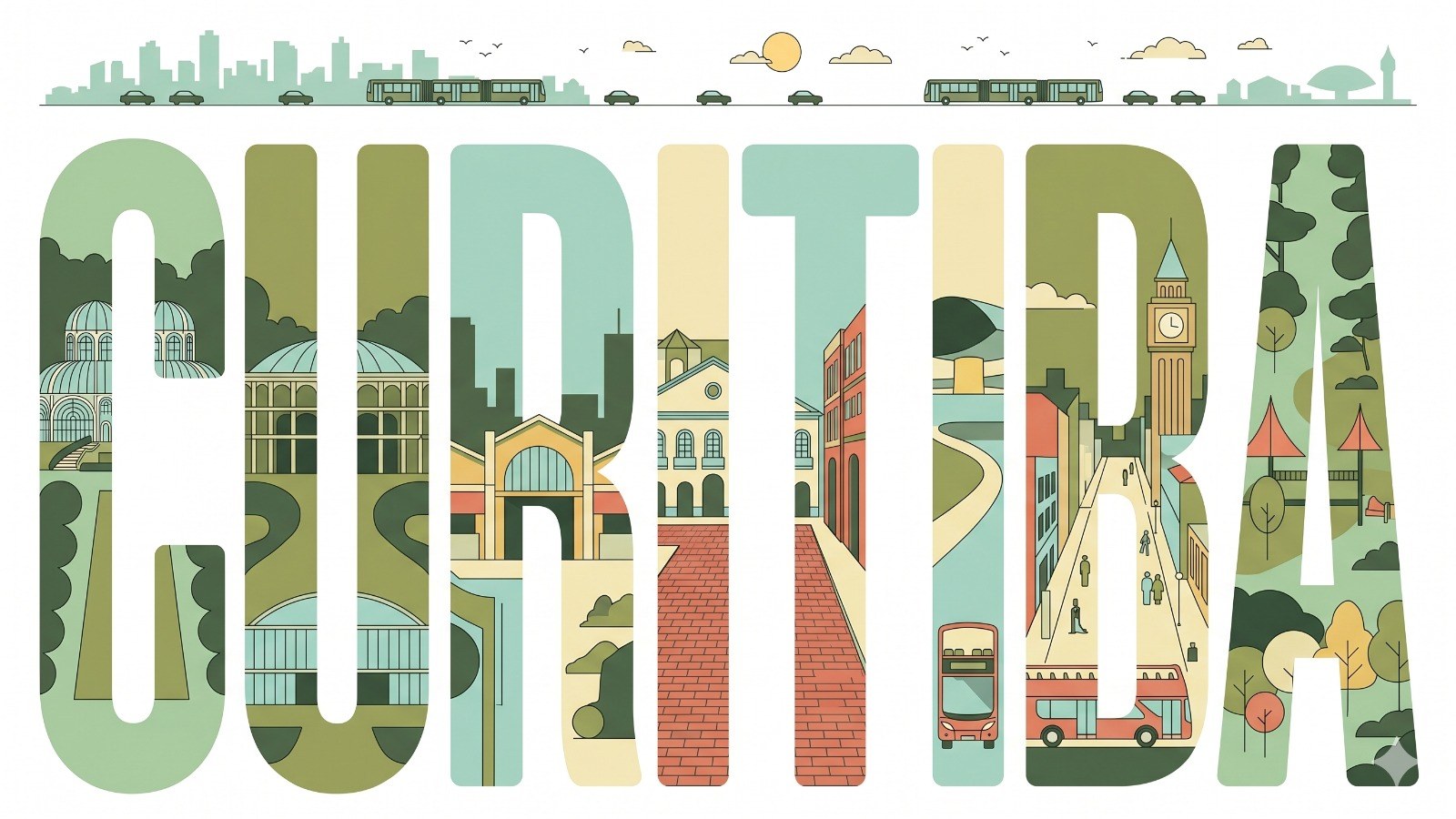
Place the giant English word “CIDADE ESCOLHIDA” prominently in the center of the composition
Each individual letter should contain a different illustrated scene from the city
Letters should be tall, elongated, bold sans-serif forms
The typography itself should feel like a series of “city gallery windows”
Distribute landmarks, streets, transportation, nature, culture, and architecture naturally across the letters
Scenes should visually flow from one letter into another like one connected urban panorama
TOP HORIZONTAL STRIP:
At the top of the poster, include a thin panoramic horizontal strip containing:
city skyline silhouettes
cars
trams or trains
boats if relevant
birds
clouds
sun
All elements should appear minimalist, elegant, and rhythmically balanced.
STYLE:
mid-century modern editorial poster,
Swiss graphic design,
minimal vector illustration,
architectural infographic aesthetic,
travel typography poster,
flat geometric illustration,
ultra clean composition,
premium magazine design,
screenprint poster feeling,
retro-futuristic travel branding
ILLUSTRATION STYLE:
flat vector shapes only
no realism
no gradients
no texture noise
clean geometric shadows
simplified architectural forms
map-like top-down illustration mixed with side-view cityscape
subtle line-art details
perfectly clean vector edges
strong negative space usage
harmonious visual rhythm between letters
TYPOGRAPHY:
giant bold sans-serif typography
letters occupy most of the canvas height
ultra precise alignment
each letter acts as an independent framed illustration panel
smooth rounded corners where appropriate
editorial spacing
highly balanced composition
typography must look professionally designed, print-ready, and geometrically perfect
COLOR PALETTE:
Automatically derive a cohesive palette inspired by CIDADE ESCOLHIDA.
Examples:
coastal city → aqua, sand, coral, muted teal
desert city → terracotta, beige, warm cream
cyber city → mint, navy, steel blue
historic European city → dusty rose, olive green, parchment
Use:
muted pastel tones
soft vintage travel poster colors
elegant low-saturation combinations
maximum 4–6 colors only
CONTENT GENERATION:
Automatically include:
iconic landmarks of CIDADE ESCOLHIDA
famous streets and transportation
local urban patterns
nearby nature elements
skyline silhouettes
bridges, rivers, or coastline if relevant
culturally symbolic architecture
recognizable local atmosphere
COMPOSITION:
centered typography composition
white or soft ivory background
lots of breathing room
top panoramic strip balances the heavy typography below
asymmetrical but visually balanced layout
each letter contains different scene depth and perspective
premium poster hierarchy with museum-quality layout
MOOD:
premium,
intellectual,
calm,
design-forward,
travel editorial aesthetic,
stylish enough for a museum gift shop poster
QUALITY:
8K ultra detailed,
print-ready,
extremely sharp vector edges,
perfect typography rendering,
clean professional graphic design,
high-end editorial poster quality,
no distorted text,
no random characters,
no spelling errors,
no AI artifacts
Aspect ratio: (16:9 poster)
IMPORTANT:
All visible text inside the poster must be in English only.
Typography must be perfectly spelled and professionally typeset.
Absolutely no distorted letters, random symbols, broken text, or AI-generated gibberish.
Aspect ratio: 16:9 poster
CORE COMPOSITION:
Place the giant English word “CIDADE ESCOLHIDA” prominently in the center of the composition
Each individual letter should contain a different illustrated scene from the city
Letters should be tall, elongated, bold sans-serif forms
The typography itself should feel like a series of “city gallery windows”
Distribute landmarks, streets, transportation, nature, culture, and architecture naturally across the letters
Scenes should visually flow from one letter into another like one connected urban panorama
TOP HORIZONTAL STRIP:
At the top of the poster, include a thin panoramic horizontal strip containing:
city skyline silhouettes
cars
trams or trains
boats if relevant
birds
clouds
sun
All elements should appear minimalist, elegant, and rhythmically balanced.
STYLE:
mid-century modern editorial poster,
Swiss graphic design,
minimal vector illustration,
architectural infographic aesthetic,
travel typography poster,
flat geometric illustration,
ultra clean composition,
premium magazine design,
screenprint poster feeling,
retro-futuristic travel branding
ILLUSTRATION STYLE:
flat vector shapes only
no realism
no gradients
no texture noise
clean geometric shadows
simplified architectural forms
map-like top-down illustration mixed with side-view cityscape
subtle line-art details
perfectly clean vector edges
strong negative space usage
harmonious visual rhythm between letters
TYPOGRAPHY:
giant bold sans-serif typography
letters occupy most of the canvas height
ultra precise alignment
each letter acts as an independent framed illustration panel
smooth rounded corners where appropriate
editorial spacing
highly balanced composition
typography must look professionally designed, print-ready, and geometrically perfect
COLOR PALETTE:
Automatically derive a cohesive palette inspired by CIDADE ESCOLHIDA.
Examples:
coastal city → aqua, sand, coral, muted teal
desert city → terracotta, beige, warm cream
cyber city → mint, navy, steel blue
historic European city → dusty rose, olive green, parchment
Use:
muted pastel tones
soft vintage travel poster colors
elegant low-saturation combinations
maximum 4–6 colors only
CONTENT GENERATION:
Automatically include:
iconic landmarks of CIDADE ESCOLHIDA
famous streets and transportation
local urban patterns
nearby nature elements
skyline silhouettes
bridges, rivers, or coastline if relevant
culturally symbolic architecture
recognizable local atmosphere
COMPOSITION:
centered typography composition
white or soft ivory background
lots of breathing room
top panoramic strip balances the heavy typography below
asymmetrical but visually balanced layout
each letter contains different scene depth and perspective
premium poster hierarchy with museum-quality layout
MOOD:
premium,
intellectual,
calm,
design-forward,
travel editorial aesthetic,
stylish enough for a museum gift shop poster
QUALITY:
8K ultra detailed,
print-ready,
extremely sharp vector edges,
perfect typography rendering,
clean professional graphic design,
high-end editorial poster quality,
no distorted text,
no random characters,
no spelling errors,
no AI artifacts