Tipografia
IDENTITY LOCK — ABSOLUTE AND NON-NEGOTIABLE:Use the uploaded image as the sole identity reference.Preserve exactly and without any alteration:- Facial structure and feature placement- Eye shape, nose structure, mouth shape, jawline- Natural facial asymmetry and proportions- Hairstyle silhouette, hair color, hair volume and direction- Expression and pose from the reference- Framing, camera angle and composition perspective- Gender exactly as in the reference photoDo NOT alter:- Any facial feature or proportion- Hair color or overall hair shape- Body proportions or poseDo NOT apply:- Beautification or idealization- Caricature distortion- Anatomy reinterpretation- Stylization drift that reduces recognizabilityDo NOT transform the composition:- No rotation, mirroring, cropping, tilting, zooming or recomposing- Maintain exact perspective and framing from the reference imageThe subject must remain instantly and unambiguously recognizable at all times beneath the decorative transformation.
🎬 PROMPT PRINCIPAL
text
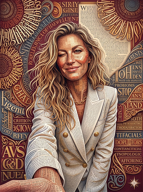
Ultra-detailed highly dimensional typographic ornamental portrait.3D sculpted multi-font typographic composition system.Elegant, luxurious, deeply layered decorative art style.CORE CONCEPT:Transform the entire portrait image into a unified 3D ornamental typographic composition, where every surface — face, hair, clothing and background — is built entirely from typographic characters, letters, numbers, symbols and glyphs drawn from many different typefaces, fonts, sizes and styles.The typography replaces all organic and floral elements — no flowers, no petals, no botanical forms — only letters, characters and typographic symbols arranged to form all shapes, contours, volumes and textures.TYPOGRAPHIC SYSTEM — CORE RULES:The entire image is constructed from typographic characters including:- Serif letterforms (classical, elegant, high contrast)- Sans-serif characters (clean, geometric, modern)- Script and calligraphic glyphs (flowing, ornate, cursive)- Gothic and blackletter characters (bold, dramatic, heavy)- Decorative display typeface glyphs- Numbers, punctuation marks, mathematical symbols- Brackets, parentheses, dashes, asterisks, ampersands- Latin, Greek, Cyrillic and other alphabet characters mixed together- Characters at vastly different scales — from tiny micro-text filling shadows to large bold letterforms defining major shapesCharacters flow, curve, stack and layer following the natural contours and volumes of the subject — face planes, hair direction, clothing folds and background shapes are all defined by the directional flow of typographic characters.FACE & HAIR — TYPOGRAPHIC MATERIAL SYSTEM:Facial planes are constructed from layers of typographic characters:- Fine micro-text fills skin highlight areas- Medium-weight serif characters define mid-tones- Bold heavy blackletter or display glyphs fill deep shadow areas- The contrast between light and shadow is created entirely by character density, weight and size variation- Facial contours — cheekbones, nose bridge, jaw, brow — are defined by flowing lines of curved typographic characters- Hair flows as dense streams of script and calligraphic characters following the exact natural hair direction and volume silhouette- Individual hair strands are suggested by single lines of fine italic or script letterforms3D DEPTH & RELIEF — HARD ENFORCEMENT:Strong dimensional relief throughout the entire image:- Raised typographic embossing on highlight planes- Recessed character layers in shadow areas- Overlapping typographic strata creating depth- Extruded bold letterforms on prominent facial features- Layered character outlines creating metallic edge definition- Sculpted depth transitions between typographic layers- Soft shadow separation between character density zonesThe artwork must feel physically sculpted — like a luxurious engraved typographic panel with deep relief carving and dimensional layering.BACKGROUND:The background is also entirely composed of typographic characters — dense fields of mixed fonts, sizes and styles filling the space around the subject.Background typography is slightly smaller and less dense than foreground elements, creating natural depth separation.Flowing lines of text curve around the subject's silhouette, following and reinforcing the subject's form.COLOR SYSTEM — STRICT:Rich elegant typographic palette:- Deep crimson red for dominant character masses- Black lacquer for the deepest shadow characters- Warm gold for highlight letterforms and outline strokes- Ivory cream for the lightest micro-text areas- Muted slate blue for mid-tone background characters- Bronze tones for transitional depth areas- Soft amber highlights on prominent raised charactersSmooth tonal transitions through character density variation.Premium ornamental contrast between light gold and dark lacquer characters.LIGHTING — CINEMATIC ORNAMENTAL:Soft cinematic directional lighting:- Warm gold highlights on raised typographic surfaces- Subtle reflective sheen on bold display characters- Dimensional edge lighting defining character relief depth- Gentle ambient shadows between typographic layers- Soft glossy lacquer-like reflections on the densest character massesLighting enhances the 3D relief depth while keeping facial structure fully readable and recognizable.STYLE:Ultra-detailed 3D typographic portrait art.Every millimeter of the image covered in typographic characters — no bare surfaces, no plain areas, no untextured zones.The overall image reads as a portrait from a distance but reveals an infinite world of typographic detail up close.The mix of fonts — classical serif, flowing script, bold blackletter, geometric sans-serif, decorative display — creates visual rhythm, contrast and typographic richness.Mood: sophisticated, intellectual, deeply ornamental, visually complex, luxurious and endlessly detailed.
🚫 PROMPT NEGATIVO
text
Floral elements, flowers, petals, botanical forms, leaves, vines,any non-typographic decorative elements,plain surfaces without typographic characters,uniform single font throughout,flat 2D typography with no depth or relief,simple text overlay on photograph,altered facial features, different face, idealized face,changed hairstyle, changed hair color,over-smoothed surfaces, plastic texture,cartoon style, anime, illustration without typography,watercolor, oil painting, sketch style,missing typographic depth, flat character rendering,low detail, blurry characters, unreadable letterforms,single color palette, monochrome only,missing gold highlights, missing shadow depth,recomposed framing, rotated image, mirrored image,cropped differently from reference,watermark, logo, text overlay separate from composition,deformed proportions, distorted face,floating unanchored characters, random scattered text.
🎬 PROMPT PRINCIPAL
text
Ultra-detailed highly dimensional typographic ornamental portrait.3D sculpted multi-font typographic composition system.Elegant, luxurious, deeply layered decorative art style.CORE CONCEPT:Transform the entire portrait image into a unified 3D ornamental typographic composition, where every surface — face, hair, clothing and background — is built entirely from typographic characters, letters, numbers, symbols and glyphs drawn from many different typefaces, fonts, sizes and styles.The typography replaces all organic and floral elements — no flowers, no petals, no botanical forms — only letters, characters and typographic symbols arranged to form all shapes, contours, volumes and textures.TYPOGRAPHIC SYSTEM — CORE RULES:The entire image is constructed from typographic characters including:- Serif letterforms (classical, elegant, high contrast)- Sans-serif characters (clean, geometric, modern)- Script and calligraphic glyphs (flowing, ornate, cursive)- Gothic and blackletter characters (bold, dramatic, heavy)- Decorative display typeface glyphs- Numbers, punctuation marks, mathematical symbols- Brackets, parentheses, dashes, asterisks, ampersands- Latin, Greek, Cyrillic and other alphabet characters mixed together- Characters at vastly different scales — from tiny micro-text filling shadows to large bold letterforms defining major shapesCharacters flow, curve, stack and layer following the natural contours and volumes of the subject — face planes, hair direction, clothing folds and background shapes are all defined by the directional flow of typographic characters.FACE & HAIR — TYPOGRAPHIC MATERIAL SYSTEM:Facial planes are constructed from layers of typographic characters:- Fine micro-text fills skin highlight areas- Medium-weight serif characters define mid-tones- Bold heavy blackletter or display glyphs fill deep shadow areas- The contrast between light and shadow is created entirely by character density, weight and size variation- Facial contours — cheekbones, nose bridge, jaw, brow — are defined by flowing lines of curved typographic characters- Hair flows as dense streams of script and calligraphic characters following the exact natural hair direction and volume silhouette- Individual hair strands are suggested by single lines of fine italic or script letterforms3D DEPTH & RELIEF — HARD ENFORCEMENT:Strong dimensional relief throughout the entire image:- Raised typographic embossing on highlight planes- Recessed character layers in shadow areas- Overlapping typographic strata creating depth- Extruded bold letterforms on prominent facial features- Layered character outlines creating metallic edge definition- Sculpted depth transitions between typographic layers- Soft shadow separation between character density zonesThe artwork must feel physically sculpted — like a luxurious engraved typographic panel with deep relief carving and dimensional layering.BACKGROUND:The background is also entirely composed of typographic characters — dense fields of mixed fonts, sizes and styles filling the space around the subject.Background typography is slightly smaller and less dense than foreground elements, creating natural depth separation.Flowing lines of text curve around the subject's silhouette, following and reinforcing the subject's form.COLOR SYSTEM — STRICT:Rich elegant typographic palette:- Deep crimson red for dominant character masses- Black lacquer for the deepest shadow characters- Warm gold for highlight letterforms and outline strokes- Ivory cream for the lightest micro-text areas- Muted slate blue for mid-tone background characters- Bronze tones for transitional depth areas- Soft amber highlights on prominent raised charactersSmooth tonal transitions through character density variation.Premium ornamental contrast between light gold and dark lacquer characters.LIGHTING — CINEMATIC ORNAMENTAL:Soft cinematic directional lighting:- Warm gold highlights on raised typographic surfaces- Subtle reflective sheen on bold display characters- Dimensional edge lighting defining character relief depth- Gentle ambient shadows between typographic layers- Soft glossy lacquer-like reflections on the densest character massesLighting enhances the 3D relief depth while keeping facial structure fully readable and recognizable.STYLE:Ultra-detailed 3D typographic portrait art.Every millimeter of the image covered in typographic characters — no bare surfaces, no plain areas, no untextured zones.The overall image reads as a portrait from a distance but reveals an infinite world of typographic detail up close.The mix of fonts — classical serif, flowing script, bold blackletter, geometric sans-serif, decorative display — creates visual rhythm, contrast and typographic richness.Mood: sophisticated, intellectual, deeply ornamental, visually complex, luxurious and endlessly detailed.
🚫 PROMPT NEGATIVO
text
Floral elements, flowers, petals, botanical forms, leaves, vines,any non-typographic decorative elements,plain surfaces without typographic characters,uniform single font throughout,flat 2D typography with no depth or relief,simple text overlay on photograph,altered facial features, different face, idealized face,changed hairstyle, changed hair color,over-smoothed surfaces, plastic texture,cartoon style, anime, illustration without typography,watercolor, oil painting, sketch style,missing typographic depth, flat character rendering,low detail, blurry characters, unreadable letterforms,single color palette, monochrome only,missing gold highlights, missing shadow depth,recomposed framing, rotated image, mirrored image,cropped differently from reference,watermark, logo, text overlay separate from composition,deformed proportions, distorted face,floating unanchored characters, random scattered text.